Case Study: civilrights.justice.gov
Designing with Empathy: transforming the way DOJ Civil Rights collects, sorts, and responds to civil rights complaints
Role:
Product / Visual Design Lead at 18F
Partner/Client:
Department of Justice, Civil Rights Division
Methods & Tools:
Sketch, Photoshop, in-person and remote service and design workshops, remote user feedback and interview sessions
Project overview
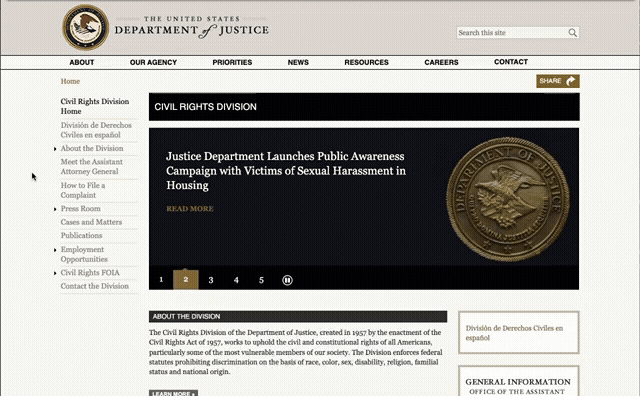
The U.S. Department of Justice Civil Rights Division (CRT) enforces federal laws that protect everyone in the United States from discrimination based on race, color, national origin, disability status, sex, sexual orientation, religion, familial status, gender identity (in some cases), and loss of other constitutional rights.
CRT fights against discrimination in housing, voting, employment, education, immigration, and many other areas. The public submits over 100K complaints to CRT a year, often coming from the nation’s most vulnerable populations. Before our project, submitting a complaint was a confusing and inconsistent process, with more than 30 ways to report, including by web, email, phone, fax, and physical letter. Most had missing or incomplete information and CRT staff spent most of their time processing un-actionable complaints instead of supporting victims.
18F partnered with DOJ to design and build a new way for the public to submit these civil rights complaints—moving from disparate processes for each section of the Division—to one uniform complaint portal. This led to the creation of civilrights.justice.gov and a new internal case management system for the Division to view, sort, and respond to the complaints. By focusing on improving the internal working methods within the Division, as well as the public-facing user experience, the Division now has access to key data to become more responsive and proactive to the needs of the American public. Our team led with empathy-centered practices, taking into account the sensitive subject matter and experiences of our users and building something that could speak both in humane and legally accurate ways.
Role & approach:
Product Design / Visual Design Lead, User-Centered Design Researcher
As the Product / Visual Design Lead, I was responsible for the front-facing design and user experience of both civilrghts.justice.gov and the new internal tracking system. I was part of an award-winning interdisciplinary POC woman-led team, from the initial discovery phase through launch, and continued to support CRT with enhancements afterwards.
During the discovery phase (1), along with our UX and product leads, I led crucial research and strategy through in-person workshops and observation, user and stakeholder interviews to assess the current public complaint intake process and internal correspondence systems. We mapped service processes and examined complex legal jurisdictions and policy in order to design a more streamlined and legally sound product.
I guided CRT in the creation of experience design principles that helped shape our work moving forward.
I helped craft recommendations for the tech stack, focusing on the ability to customize for our needs and create a modern and secure shared service that would allow CRT to successfully identify, document and access the information, save costs, employee time, and provide more value to the Division and the public.
During the prototyping phase (2), I designed complex forms, interactions, and user flows, and conducted testing for usability and accessibility with both public participants and CRT staff. I created detailed research reports, presentations and led workshops to craft the design strategy.
I developed and tested a new visual style for CRT and introduced the U.S. Web Design System.
During the build and launch phases (3), I created detailed mockups and annotations for all pages of the new website and internal tracking system, working hand-in-hand with developers to execute our designs, ensuring attention to detail and faithful implementation of the prototypes. We worked closely with staff at CRT throughout the whole process, teaching as we went, so they could successfully run the product once we rolled off.
I created a detailed custom version of the U.S. Web Design System for CRT. This system went on to be used to redesign ada.gov (which I led) and eventually replaced the visual style of all of justice.gov. I also created a custom piece of digital art for the landing page, referencing the history of civil rights in the United States, which was used in launch materials on social media and email.
The challenges
Understanding the service ecosystem and aligning stakeholders
Before any design work could begin, we needed a clear picture of the Civil Rights Division’s complex service ecosystem. We engaged with 10 distinct stakeholder groups, each responsible for a different area of civil rights enforcement—ranging from disability rights and voting to housing and education. These groups operated in silos, with little coordination or shared visibility into one another’s processes, tools, or lessons learned.
To bridge this disconnect, we facilitated workshops with up to 30 participants at a time, each representing different workflows, priorities, and assumptions. Intake methods varied dramatically: some Sections relied on mailed forms, others on phone calls or even fax machines, while only three had digital forms in place. To make sense of this fragmentation, we created a comprehensive intake workflow diagram, mapping out the overlapping and diverging practices across the Division. This visual became a powerful tool—not just for identifying where our design efforts could have the most impact, but also for helping stakeholders themselves recognize the need for a more unified, public-friendly approach.

Intake workflow diagram
Legal complexity
CRT operates under a complex legal landscape, encompassing more than 30 federal and constitutional statutes, including the Americans With Disabilities, Fair Housing, Voting Rights , Equal Credit Opportunity, Equal Education Opportunities , and the Matthew Shepard & James Byrd Jr. Hate Crimes Prevention Acts.
Communicating these legal frameworks to the public posed a unique challenge—not only did our team need to deeply understand the laws themselves, but we also needed to create a system that helped individuals with little or no legal background navigate them effectively.
Complicating matters further, the Civil Rights Division is not the only federal body responsible for civil rights issues. Depending on the nature of a complaint—whether it involved employment discrimination, hate crimes, or something else—individuals might need to file with other agencies such as the Equal Employment Opportunity Commission (EEOC) or the FBI. For the average person, understanding where to turn for help was often overwhelming and unclear.
Before our intervention, the Civil Rights Division was only able to take action on approximately 25% of the complaints it received. In most cases, this was not due to a lack of merit, but rather because the Division lacked jurisdiction. Individuals were often submitting complaints to the wrong place simply because the process was too confusing to navigate.

This is screenshot from a virtual workshop we facilitated to figure out how to route public users to the right specialist group in the Division, dependent upon specific details within their issue.
Sensitive subject matter
At the heart of this work were the people reaching out for help—often in moments of crisis. The civil rights violations being reported were not abstract legal issues; they were deeply personal, frequently traumatic, and often urgent. Whether someone was facing housing discrimination, threats to their voting rights, or abuse by a police officer, we understood that our users were likely coming to this system in a heightened emotional state—frustrated, scared, or exhausted. This reality demanded more than just functional design. It required empathy, care, and an intentional effort to meet people where they were. We invested time in understanding the emotional weight behind these experiences and how that might shape a person’s ability to navigate bureaucratic systems. Every word, interaction, and design decision had to acknowledge the seriousness of what people were going through—and work to reduce, not compound, their burden.
Sustainable technology transformation
At 18F, our guiding philosophy was to work ourselves out of a job. Recognizing that we couldn’t possibly build or improve every government system ourselves—no matter how much we wanted to—we focused instead on empowering our partners. With the Department of Justice, this meant collaborating closely throughout the process, not just delivering a product. We prioritized knowledge transfer, sustainable design, and capacity building to ensure the work could continue long after our engagement ended. Every decision, from project scope to technical implementation, was made with long-term sustainability in mind.
Rebuilding trust
One of the most significant challenges we faced was addressing the public’s deep mistrust of government—particularly in the context of civil rights. Our work took place during the first Trump administration, a period marked by heightened skepticism and fear among marginalized communities who are most often impacted by civil rights violations. While these concerns were rooted in real and visible shifts at the federal level, we also saw a different story inside the Civil Rights Division. Many of the lawyers and staff we worked with had spent decades committed to advancing civil rights, regardless of the political climate. A key part of our challenge was helping the public distinguish between the long-term mission of the Division and the broader shifts in administration—so people could see that, even in uncertain times, there were still dedicated professional civil servants working to protect their rights.
Methodologies & outcomes

Designing with empathy
Center the user’s experience
Lead with inclusion
Meet users where they are
Set honest expectations
With deeply personal, high-stakes user journeys on both the public and internal sides, we had to design not just a form, but a compassionate experience. Here's how we centered empathy at every layer of the design process—from research and inclusion to trauma-informed design and cross-functional collaboration.
Center the user’s experience
Design for real people, not a list of requirements
This project demanded deep empathy. The stakes were high: vulnerable people reaching out for help, and a strained system trying to respond.
While the brief laid out organizational goals, our responsibility as human-centered designers was to validate whether those goals aligned with public needs. Our process was grounded in lived experience, not assumptions.
Understanding our users
We started by mapping all of the portal’s user groups—not just those submitting complaints, but those receiving, processing, and responding to them. The complaint intake journey extended across multiple teams and systems. It wasn’t just a form; it was a pipeline that rippled across the DOJ.
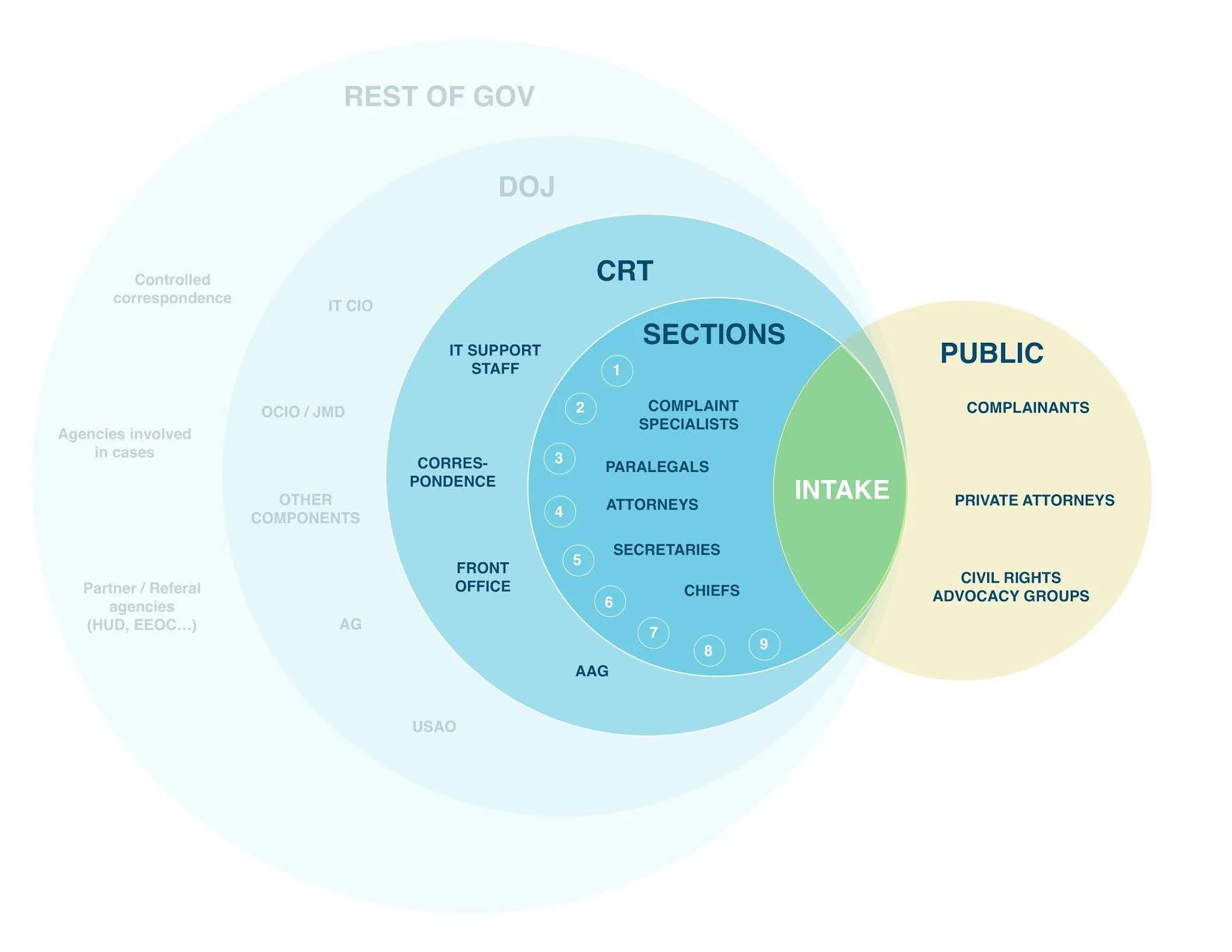
Diagram we created to visualize the user ecosystem and the relationship between public audiences and the rest of government.
We centered our most vulnerable users and designed outward from their needs. That included:
People experiencing discrimination and civil rights violations
People with low digital literacy or limited English proficiency
Internal CRT staff navigating outdated systems and enormous emotional labor
Learning from our users
Through discovery and design, we engaged over 220 research participants:
172 members of the public (connected through past complainants, civil rights organizations, and external calls for participation)
50 internal CRT staff
We used interviews, cognitive walkthroughs, shadowing, and workshops to understand pain points from both sides. We didn’t guess what users needed—we asked.
Through this, we mapped the key external and internal user journeys.
We created this joint persona story to help make the case for human-centered design with stakeholders, which helped build empathy and understanding of the issues.
Public user persona: Penny
Penny has been experiencing sexual harassment from her landlord. She believes this violates her civil rights and wants help. After reaching the U.S. Department of Justice Civil Rights Division website, it’s hard for her to understand what the Division does and what her next step is.
Screen recording showing the old flow for reporting a sexual harassment in housing complaint on justice.gov.
Penny finds her way to this “How to file a complaint” page. She’s overwhelmed by the amount of text and her stress increases as she wades through the confusing directions. She wonders if this even the right place for her. She finally finds her way to a special page for sexual harassment in housing (through small, in-paragraph links). She thinks finally she’ll find some guidance here when she clicks on the “report” button…but it just opens her email app and tell her to email them.
This feels like she’s just shouting into the abyss:
“I have to do all the work to make myself be visible, heard, and taken seriously when I’m the victim.”
Quote from public research participant
DOJ staff persona: Noah
Noah is a complaint intake specialist for DOJ’s Civil Rights Division. They just received Penny’s complaint among many others from the public.
Noah’s section is consistently receiving and spending their time processing un-actionable complaints (out of their jurisdiction, not enough information, or even something that no one in the federal government can help with).
Their work is slowed down by different physical and digital processes they have to use.

The images are from our first site visit to the CRT offices. There are boxes and boxes and rows of folders of paper complaints. These are hand sorted and kept for the legal period of time, so they take up a lot of space.
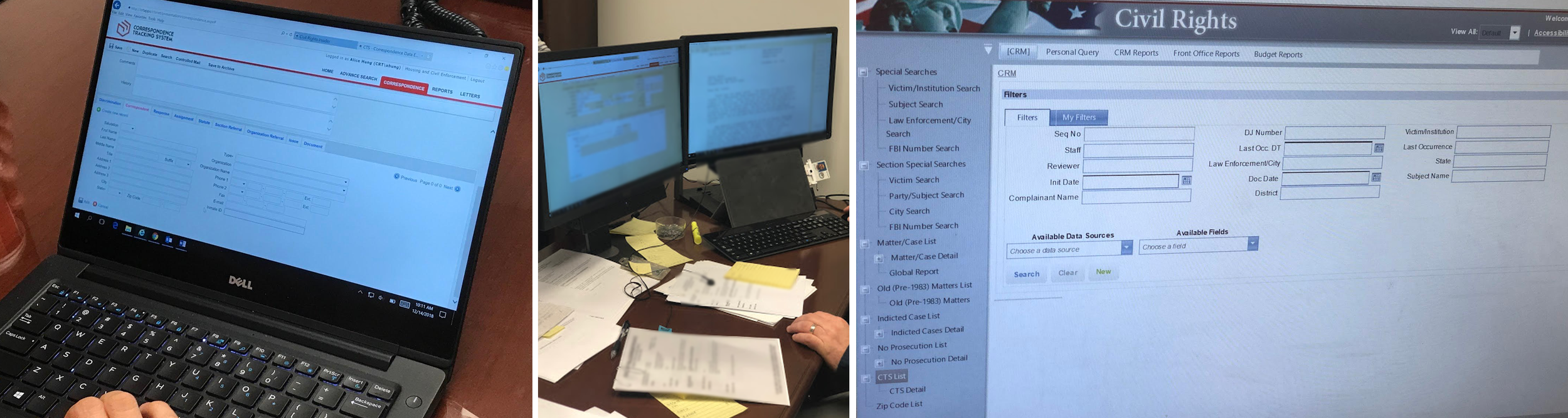
Examples of two of the inefficient and outdated record management systems.

In the end…
a bad starting point snowballs into a bad experience for everyone.
So how did we fix it?
Lead with inclusion
It’s a through line of the work, not a goal post for the end.
Inclusion wasn’t an afterthought, but a foundational principle on this project. That meant inclusive team dynamics, design practices, and user experiences.
Starting from within
Our team was intentionally diverse, and that made a measurable impact on the product. Our lived experiences informed our choices—because we knew what it felt like to be misunderstood or excluded by systems.
For example:
Our design team was all women for the first year (still a rarity in the tech world).
One member was Deaf, and others had family members who used screen readers or had cognitive disabilities.
We reflected a broad range of racial, ethnic, geographic, and generational identities.
This wasn’t about optics. It made our collaboration richer, our perspective broader, and our empathy sharper.

Our virtual launch team celebration— we have our designers, developers, product and management folks, and DOJ partners (although there were many more along the way not pictured). We worked hand in hand with our partners at CRT as one team, not in a traditional consultant/client relationship.
Building inclusion into the process
Inclusion became procedural, not just philosophical. Government websites need to legally be accessible to people with varying abilities (thanks to the Americans with Disabilities Act!)—and because it’s the right thing to do!
We baked accessibility it into every step:
Accessibility requirements for every feature from day one.
Design reviews that prioritized readability, contrast, screen reader support, and cognitive load.
Cross-functional ownership—designers, developers, and partners were all responsible.
External audits to ensure we were meeting (and exceeding) accessibility standards.
We didn’t just meet compliance. We made inclusion a creative constraint—and it made the product better.
Representation matters
Visual and verbal representation sends a message: You belong here.
Language access
We were able to add 6 new languages, in addition to originally launching with English and Spanish, although we wanted more to be available. This is especially important when it comes to civil rights issues related to immigration, discrimination or even hate crimes based on your real or assumed ethnicity.

Screenshots of desktop and mobile in Chinese and Spanish
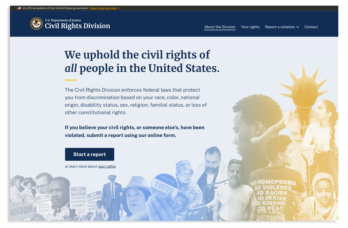
Hero image on landing page
We wanted the hero image to be inspiring but relatable. One of CRT’s goals was to help present civil rights in a modern way. So often the movement is only represented only through 1960s civil rights imagery, when the fight for equality didn’t end in that era. My challenge was how to show “civil rights” for the whole United States in one image (no pressure!)
I created several directions that explored different visual styles and conducted visual preference testing with public research participants. One method was a survey in which I asked participants to choose from a list of words they thought best described each version.

These were the 3 visual design directions I tested and the top 3 words participants associated them with. I followed up by asking which they liked the best and why.
I took the feedback and weighed it with what was most important to the Division in terms of their visual voice/tone. In the end I combined the best elements of all, making an approachable image that draws from our history of civil rights, but that feels relevant to the present, and is easy to read.
The inclusivity and empathy-centered design extended to our content writing as well.
Some of my favorite examples:
On the landing page it says, “We uphold the civil rights of all people in the United States.” This one seems simple, but historically these reports were referred to as “citizen complaints”—but these laws don’t just cover U.S. citizens, but anyone in the U.S. There are specific laws that protect non-citizens or those in the process of becoming citizens. We wanted to call this out front and center—that the civil rights division is a place for all people.
We advise individuals to call 911 if they or someone else is in immediate danger. However, we recognized the need for a more thoughtful approach in cases involving police misconduct. Directing someone to contact 911—when the police may be the subject of their complaint—can feel dismissive or even retraumatizing. To address this, I ensured the content included an alternative path: users are advised to contact the FBI in such cases, with a clear explanation and a direct link provided.
On the section of the form where users are asked to identify the personal characteristics they believe contributed to their mistreatment, we took particular care with how we addressed immigration and citizenship status. We wanted to clearly communicate that individuals—regardless of their documentation status—have rights, and that CRT treats this information with strict confidentiality.
While we understood that deep-seated mistrust cannot be fully resolved through language alone, it was essential to provide reassurance and transparency wherever possible to help individuals feel safe in sharing their experiences.
Meet users where they are
Be prepared to listen and adapt.
This project demanded a trauma-informed, radically empathetic approach. Many of our users were reaching out at their lowest points—hurt, confused, and scared.
Trauma-informed research
We adapted our methods for sensitivity:
Explained informed consent clearly and compassionately, made sure they knew they’d be anonymized, and deleted their data as soon as possible.
Let participants control the depth of their sharing and that they could stop at any point.
Responded humanely during interviews, acknowledging trauma when appropriate.
Followed up with transparency and gratitude—recognizing we could not have done this work without their insights and keeping them abreast of new developments.
We also took care of ourselves. Designing in this space was emotionally intense. Our team:
Shared feelings honestly in retros.
Created moments of “happy down time.”
Celebrated wins, big and small.
We also advocated for CRT staff—some of whom had no mental health support despite handling deeply traumatic cases daily. That advocacy extended beyond the scope of our work, but we still pushed for change.
Doing the hard work to make it simple
We wanted to make it as simple as possible for our users to get the help they need. Our job was to break down barriers to entry.
Iterative design
We streamlined the complaint form through countless iterations. Unlike a regular client-designer relationship with a set amount of iterations, we kept prototyping, testing, and refining until we felt it was the best it could be for the first product launch.
For example, in the beginning we tried to address the un-actionable complaints issue by designing a prototype with Google Forms, where we tried to tell users what the Division couldn’t help with first. However, this did not work—it turned out to be un-intuitive and confusing for users, so we moved away from that idea!
The evolution of the form design from the old justice.gov info page, to Google Form prototype, to basic USWDS, to the final high fidelity designs
Making key actions immediate and obvious
We recognized that some users arrive at the site ready to take immediate action, so we prioritized a clear and accessible path to begin the reporting process without requiring unnecessary decision-making upfront. The primary call-to-action reads, “If you believe your civil rights, or someone else’s, have been violated, submit a report using our online form,” followed by a prominent “Start a report” button.
At the same time, we understood that other users may prefer to learn more abotut the process before proceeding. To support this, I designed the landing page to offer multiple opportunities to explore more information. For example, users can browse categorized examples of civil rights violations to help determine whether this is the appropriate place to submit their concern.

This image is showing the flow from the landing page call-to-action buttons to the form or to learn more about civil rights. This is the current version of the site, with some changes to my original designs. The “Learn your rights” link is now a secondary button next to the primary “Start a report,” and the list of example violations designs has been broken out into individual drop-downs. These changes were made after I worked on it, but based on continued user research by the staff we trained.
User-centered vs org-centered journey
We redesigned the content and flow around user needs, not organizational structure. For example, before, the “How to file” page had each Section describe their individual process, with no continuity. We worked with them to create a more intuitive and streamlined journey that is centered around what actually happened to the person and why they are seeking help. This helps them tell their story in a more natural way, and all of the routing happens automatically behind the scenes.
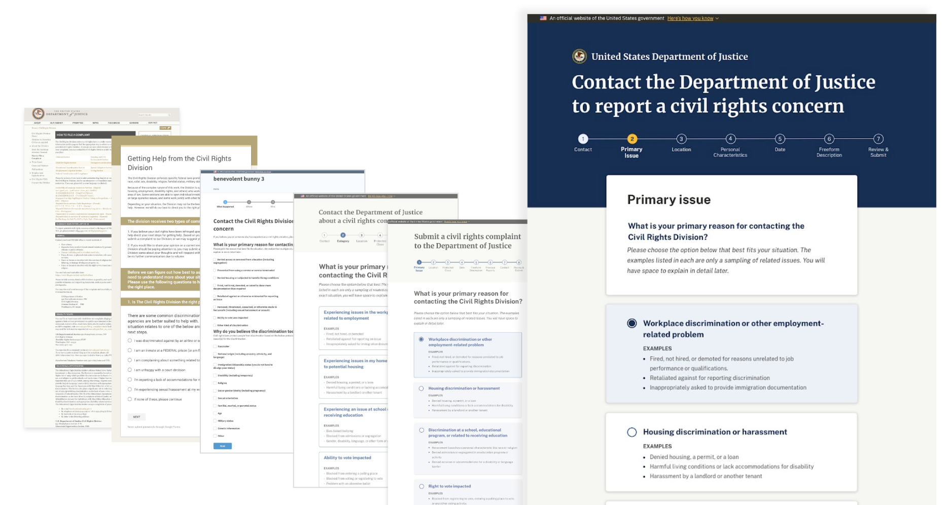
It now asks “What is your primary reason for contacting the civil rights division?” and gives clear pathways like workplace discrimination or employment related problem, housing discrimination, mistreated by police, correctional staff, or inmates, etc. Additionally, each topic includes concrete examples, which were extremely helpful in reassuring users they were in the right place, and increased their confidence as they were navigating the form.

The left image shows the old “How to file a complaint” vs my redesigned form.
Plain language
Writing in plain language is not only a legal requirement for federal agencies, but also a practical necessity—especially given that the average reading level in the U.S. is around seventh grade. Our goal was to ensure the content was clear, accessible, and easy to understand for as many people as possible. We also aimed to convey a sense of human connection: real people wrote this form, and real people will read and respond to the reports submitted. In doing so, we sought to counter the perception of government as impersonal or inaccessible and instead reflect the humanity behind the work.
Embracing different ways of participating
Internally, we adapted too. Not everyone contributed the same way—some CRT staff loved sticky notes and workshops, others needed one-on-one conversations to open up, and some responded best with follow-up emails. We made space for all of it. Empathy means flexibility—not forcing everyone into the same mold.
“One of the biggest and lasting benefits isn’t just the portal—it’s that specialists across sections are now working together. That is such a big deal.”
Quote from Civil Right Division leadership

Images of our interactive in-person and virtual workshops.
Resist the “savior complex”
One of the common pitfalls in human-centered and service design is the tendency for designers to assume the role of a “fixer”—arriving with all the solutions and best practices in hand. While it's important to have confidence in your design skills, it's equally critical to approach this work with humility.
The reality is that we are not the subject matter experts—our partners are. They understand the intricacies of their work, the systemic challenges they face, and often have valuable insights into what needs to change. However, years of navigating rigid hierarchies or organizational inaction may have left them discouraged or unheard.
Our role is to listen first. To ensure our collaborators feel seen, respected, and understood. True progress begins when we build from their lived expertise rather than imposing our own assumptions. It is not only ineffective—but potentially harmful—to position ourselves as more capable or knowledgeable than those doing the work every day, especially when many barriers they face are beyond their control.
Setting honest expectations
Empathy also means honesty (we didn’t want to create false hope).
The reality is that, no matter how great of a product we make, there are still other beurocratic challenges that exist. We did the best we could to make our piece of the puzzle the best it could be, and tried to make changes outside where we could, but we were also transparent about:
What the DOJ can and can’t do.
What users should expect after submitting.
How long it might take.
What to do in case of emergency.
We built confirmation pages and email templates that provided next steps, not just vague reassurance. We also equipped intake staff with tools to triage and respond faster, more clearly, and with empathy.
The confirmation email was a big internal win—it was the first integrated email system in the Division’s history!
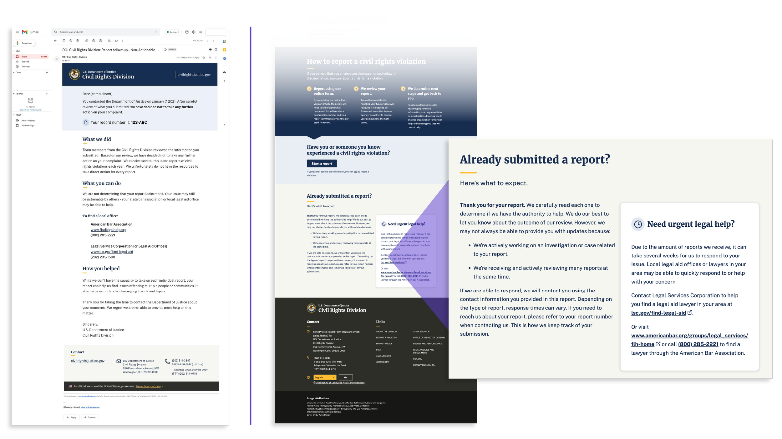
Left: email confirmation with expectation setting and next steps. Right: bottom of landing page with similar information.
Impact
Civil rights protections shouldn’t be hard to access, and in many ways they still are, but the work that our team continues to make real change for real people.
We accomplished:
The launch of civilrights.justice.gov. This site explains in clear language the scope of civil rights enforced by CRT, examples of violations, and the complaints process.
A complaint intake form. The new form has a progress tracker and clear instructions. The form design ensures more complete submissions.
Back-end ticketing and tracking system. We designed and built a system to easily route and track complaints through the investigation process. CRT staff have clear visibility into all open complaints. They can review, sort, and route complaints to the right team for investigation.
A customized and expandable web design system (based of the U.S. Web Design System) that creates visual and interactive consistency between digital spaces for users and gave CRT a clear pathway for continuing development and expansion.
While the investigation process can be complex, complaints no longer languish in the unknown. Members of the public can submit complaints and know what to expect next.
CRT staff no longer have to spend hours per week chasing missing information and routing complaints. They can devote more time to helping victims.
The portal is a single source of data about civil rights complaints and has become a powerful tool for spotting trends and patterns.

Response time dropped from 23 days to 7 days
580,000+ reports submitted since launch
Complaint backlog reduced by at least 81%, but now probably more!
The design system for the portal informed the redesign of ADA.gov and justice.gov

My customized U.S. Web Design System for CRT and visual design were expanded to the redesign of the Americans with Disabilities Act website (by me) and all of justice.gov (not me).
“This is the best government website interface page I have ever seen. It was very easy to understand and well designed”
Public feedback from live site
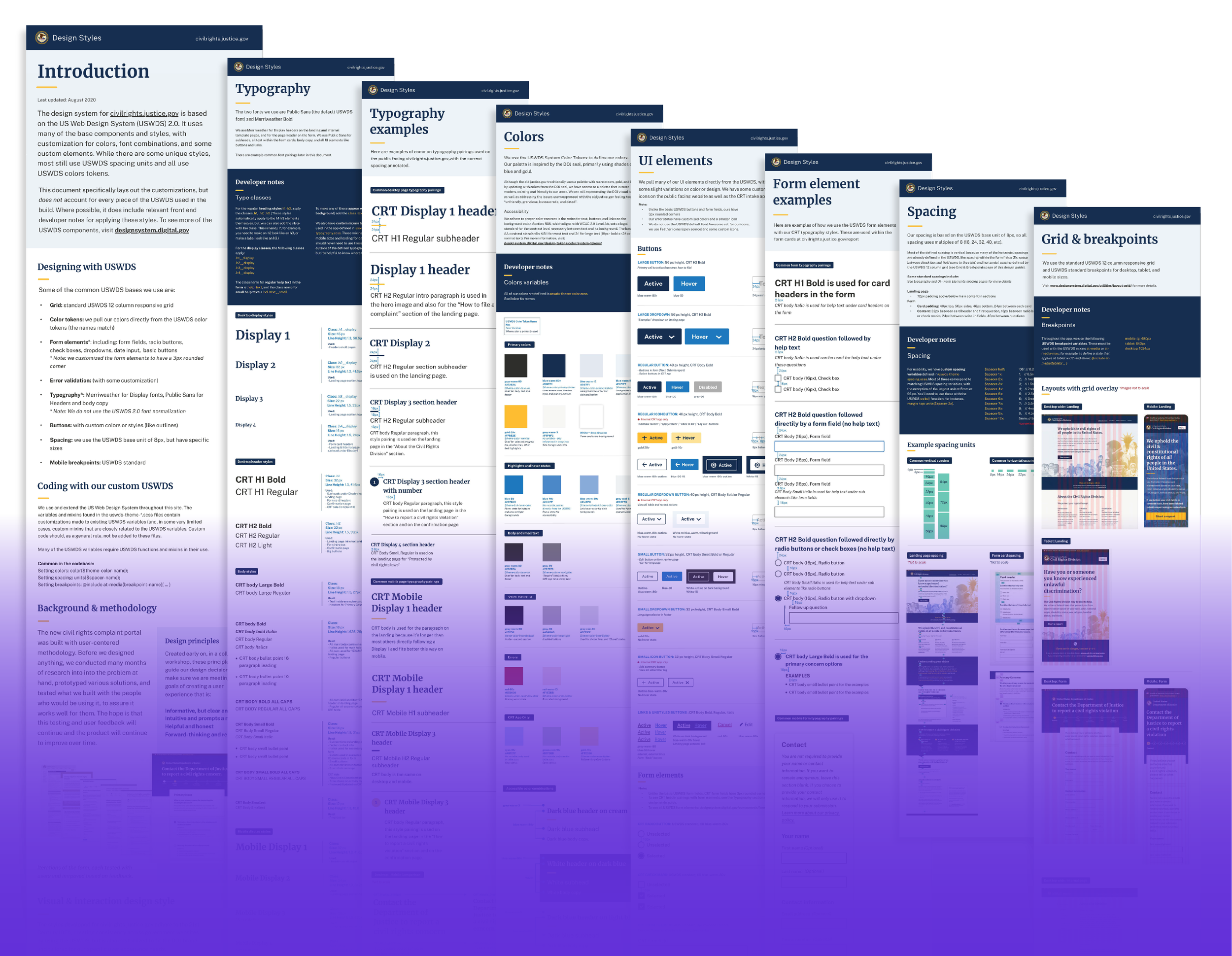
Customized U.S. Web Design System guide I created that was later expanded to redesign ADA.gov and Justice.gov
“The portal is now the model for any potential projects where we are looking to solicit feedback from the public for potential litigation.”
Portal Product Owner
Change is possible (even in the government) !
HUGE thanks to my amazing launch team—you are all amazing, true civic heroes, and I am honored to have built something like this in my life, with you.